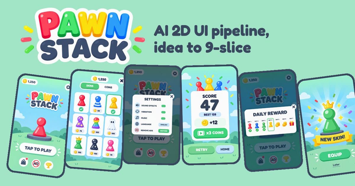
TL;DR
- You don't need Figma. An image model, an agent that can run scripts, and a browser took a new game from "give me 10 ideas" to 12 designed screens and 40+ cut sprites. 102 generations, about $4.50, 1 hour 34 minutes.
- The AI draws each thing well. It doesn't keep things the same across screens. 15 inconsistencies across 12 screens. It reported none of them.
- Past a handful of fixes, stop prompting and start composing. Editing with a list of fixes landed about half. Pasting the real cut components in code landed all of them.
On 28 September, a member of our Game Dev - AI WhatsApp group asked:
Does anyone have good experience with an asset pipeline for UI? What's the approach? Figma + MCP + a GitHub skill? Something where it's easy to change the spec of the output?
Board-game pieces, Unity, no Figma subscription. I answered in a few lines: research, lots of mock-up iterations with GPT Image 2.5, cut the components out with an agent, a design language for the whole game, 9-slice, and a human eye, because the AI will tell you something is good when it smears. Another member added the best tip of the thread: make 2 or 3 assets, test them against the mechanic, and only then continue.
Talking about a pipeline is easy. So I ran the whole thing on a new game and kept every image, prompt and measurement.
One game, one run, my way of working: GPT-Image 2.5 (with GPT-Image-2 for 4 images when the main one was overloaded) and Claude Code as the agent. Your numbers will be different.
The Game
I asked for 10 hyper-casual ideas with board-game pieces in them and picked Pawn Stack. A claw swings above a tower. You tap, it drops a Ludo pawn, and you try to stack it straight. Perfect drops give combos. A bad one topples the tower.
References: Stack (Ketchapp) for the timing drop, Tower Bloxx for the swinging crane, Jenga for the wobble, Ludo for a pawn anyone can read in five colours. Research isn't about copying. It gives the model a vocabulary.
Step 1: Mock-Ups, Then More Mock-Ups
Ten styles, one layout. Same tower, claw, score and "TAP TO DROP" in every prompt. Only the style changed: candy plastic, wood, flat vector, clay, glass, pixel art and more.
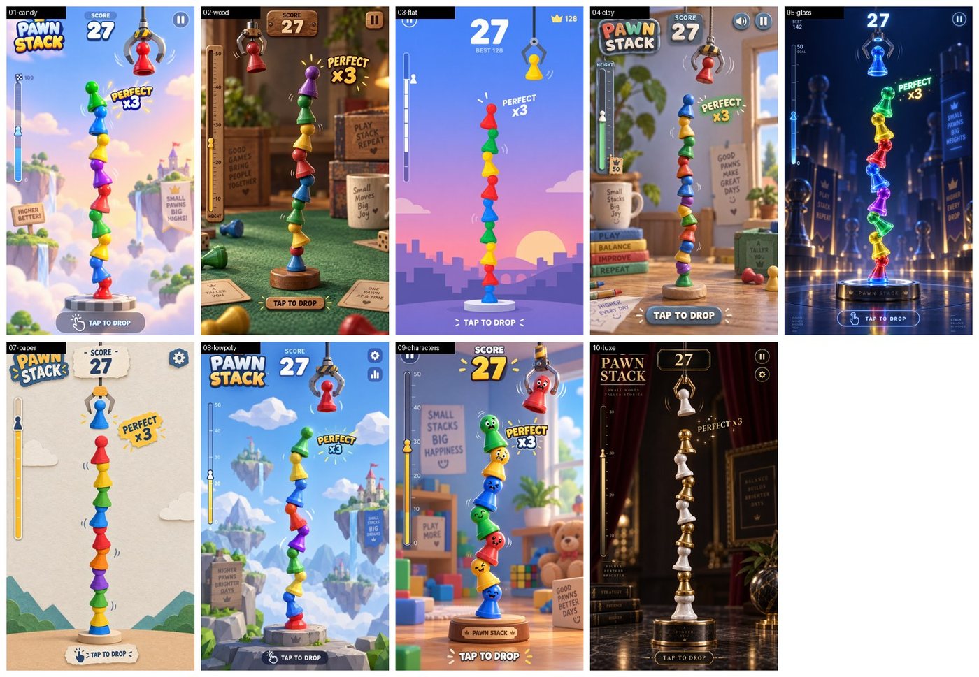
All nine that came back got the layout right. Seven of nine invented things I didn't ask for: little background signs with motivational text, like "Small pawns, big highs". Adding "no background text or signs" fixed it in 10 of 10.
I picked flat 2D, ran ten flat variations, and chose mint. One of them, white pawns on a pale background, almost disappeared. A human sees that in one second. The model never mentions it.
Then the game in motion. I sent the mint mock-up back as a reference and asked for ten moments: first drop, perfect drop, near miss, high in the sky, new best, the fall, game over, revive.
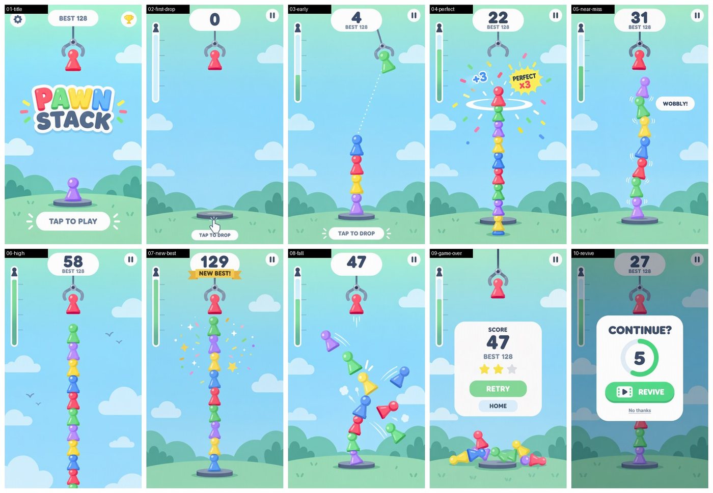
The style held perfectly. Sending a reference image to the edits endpoint does most of the work.
The story didn't. "High in the sky" still shows the grass. "New best" shows 129 points on a tower of about 13 pawns. The revive screen shows the reference's score of 27, not the 47 from the fall. Same rule as my sprite animation tests: the model draws a thing, not a sequence. You own the continuity.
Step 2: Cut the Screen Into Pieces
First an inventory: every piece across the screens, UI separated from gameplay.
One decision up front: no text in the art. Buttons and panels come out blank, and the game draws the text with a font. Scores, prices and translations change all the time. Baked into a PNG, every change is a new generation.
Then one piece per call, with the source screen attached, on a transparent background:
From the attached PAWN STACK screenshot, extract ONLY the red pawn (round head, neck, flared base) as a single standalone game asset: isolated on a fully transparent background, flat 2D, exact same colours, shapes and style as in the screenshot [...] no text.
33 calls later:
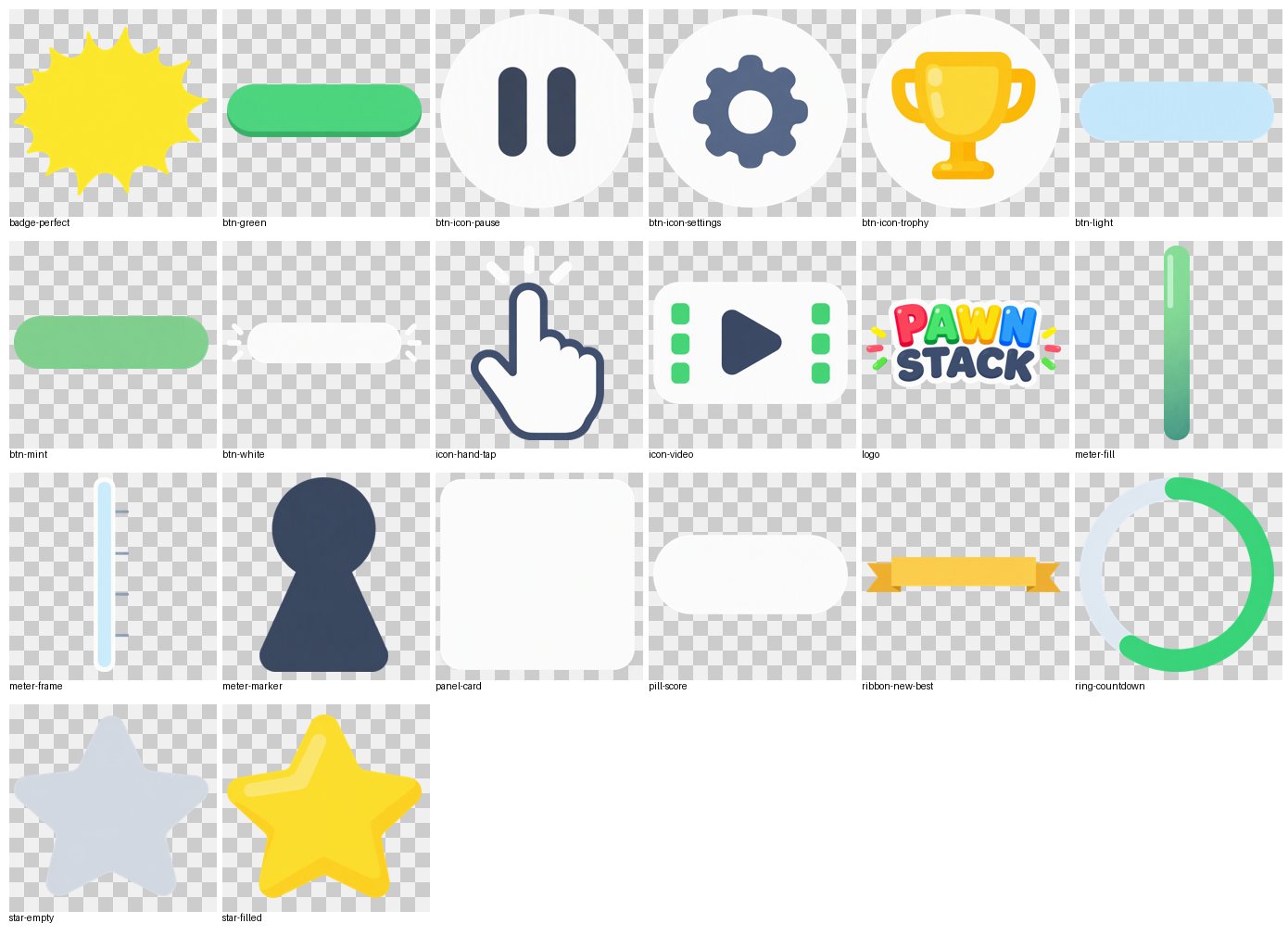
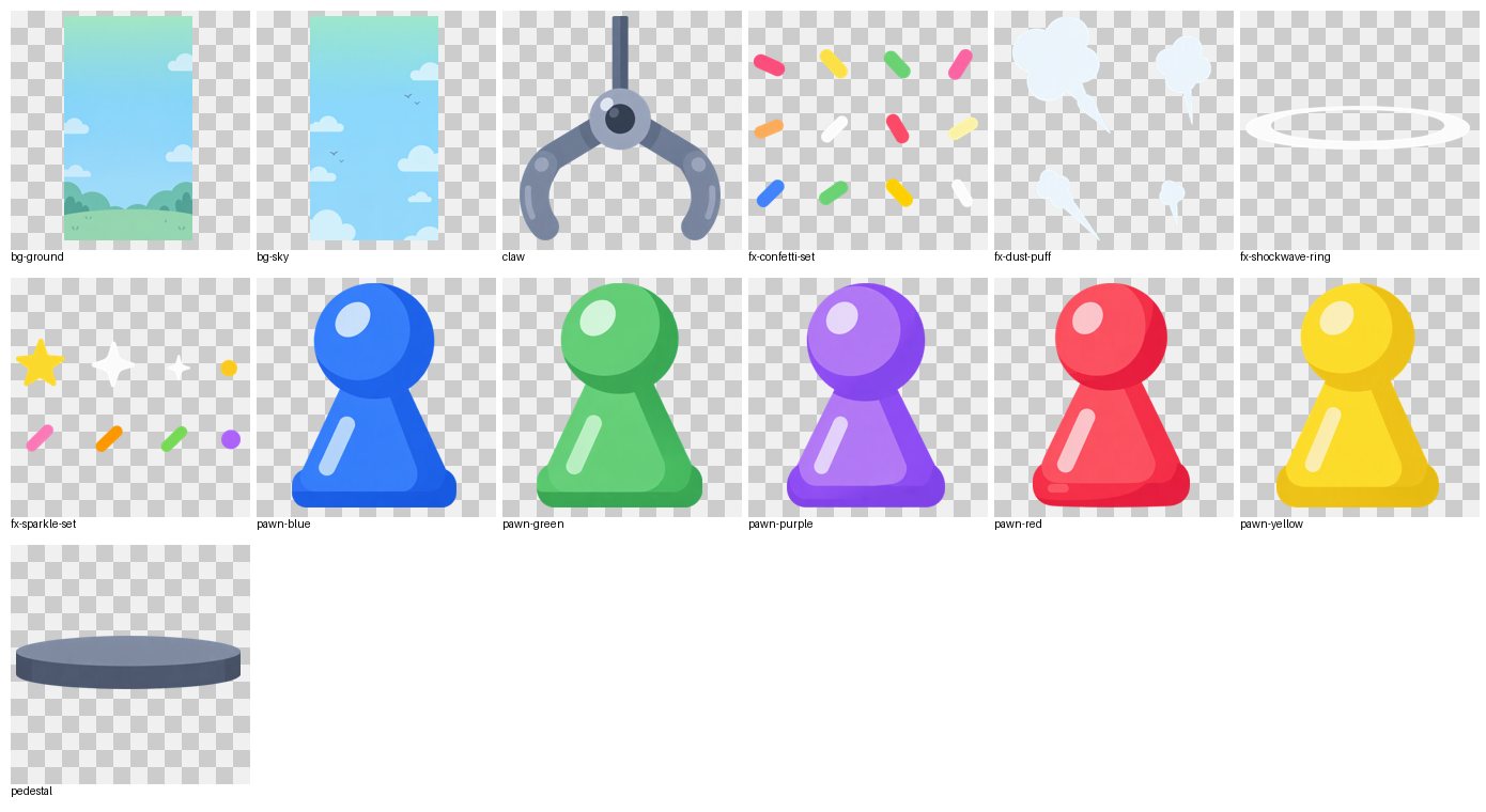
The agent cropped every piece and split the effect sheets into 24 single sprites. What I caught by eye: the pawns' heights varied by 24% (499 px to 621 px), the white button had its "tap" dashes painted on, and the mint button lost the darker bottom lip the green one has. Two buttons, two families.
Step 3: A Design Language
This is the answer to "easy to change the spec".
One sheet that says what the game looks like: palette, button family, icons, pieces and a few rules. I didn't pick the palette. The agent measured it: each colour is the median of an asset the model drew.
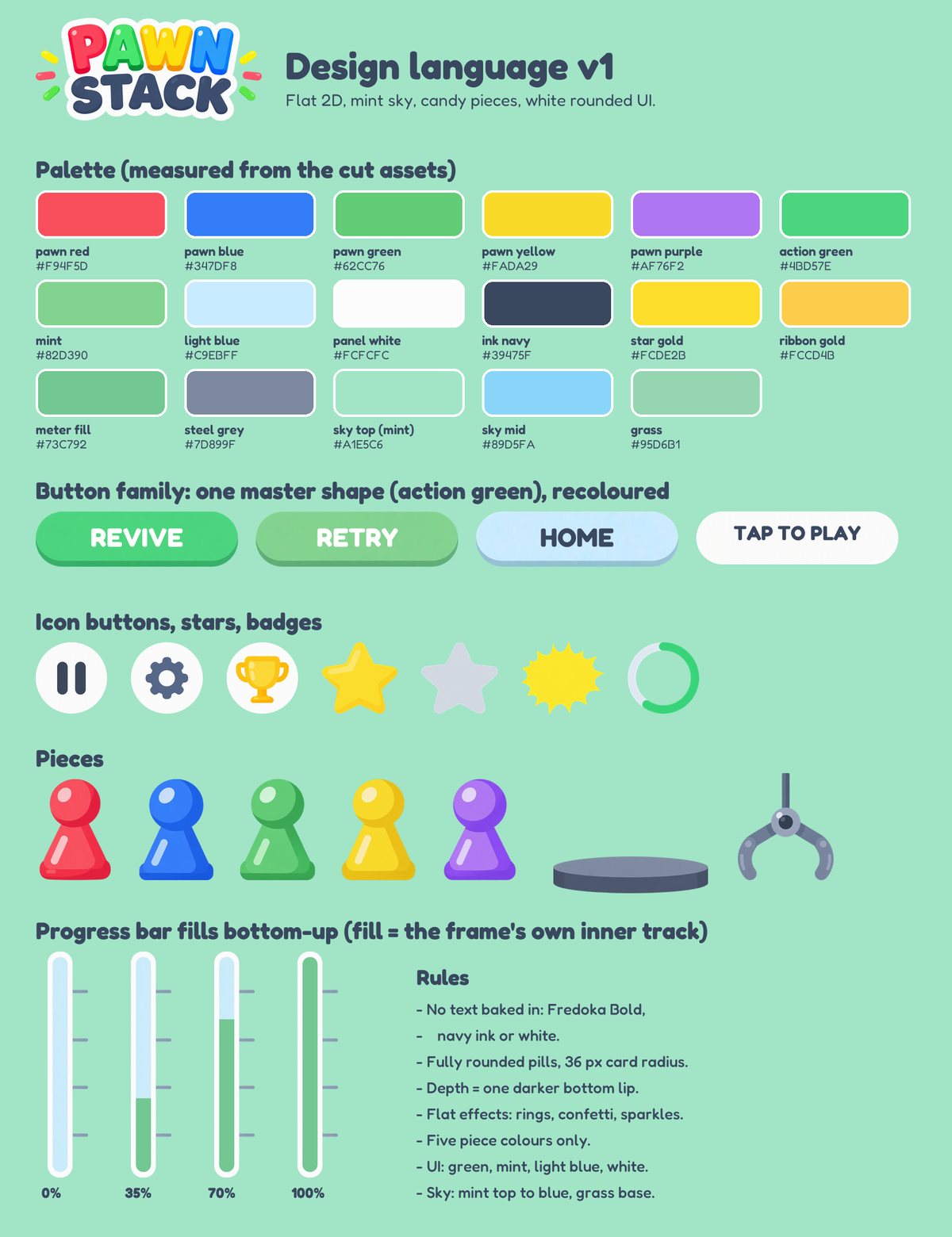
Measuring found the colour problem right away:
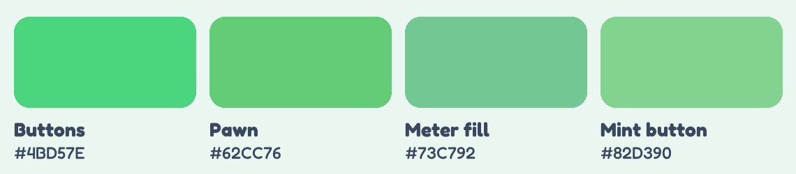
Four greens where there should be one or two. The model never said a word. You only see it when you measure.
Since text is never in the art, the font is a real decision. I tried 10 Google Fonts on the real components. Only 4 had Hebrew letters (our group speaks Hebrew). Fredoka won.
Step 4: All the Screens
With the design sheet and the title screen as references, one prompt per screen:
Attached: (1) the PAWN STACK design-language sheet and (2) the PAWN STACK title screen. Design a NEW screen of the same hyper-casual mobile game, portrait 9:16, strictly following the sheet [...]
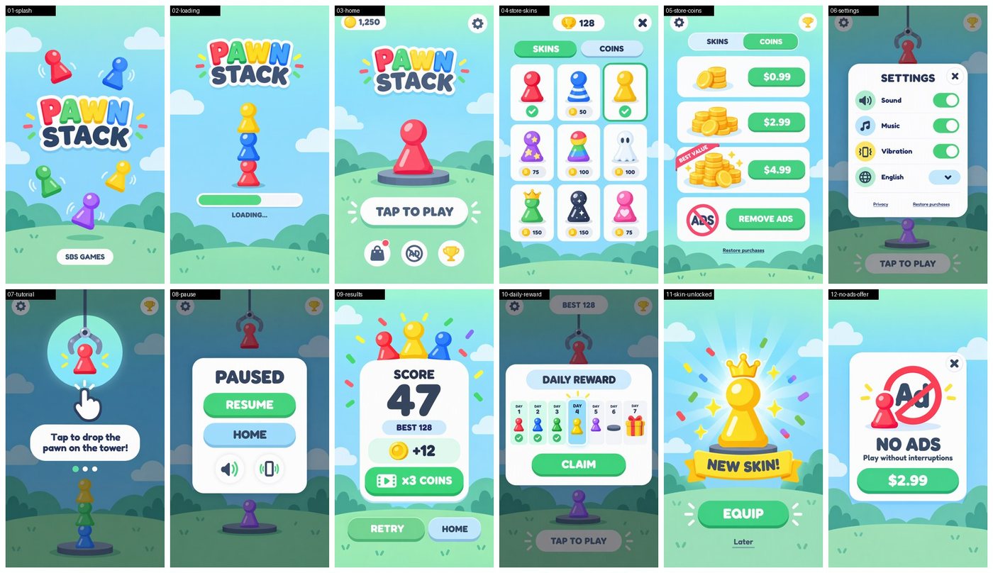
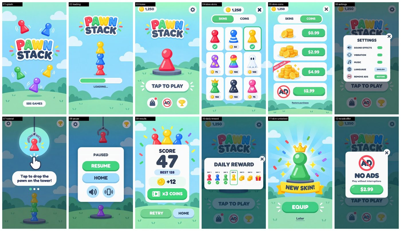
Twelve screens in one round, and at first look it's one game. Then I looked again.
The AI doesn't see the whole set
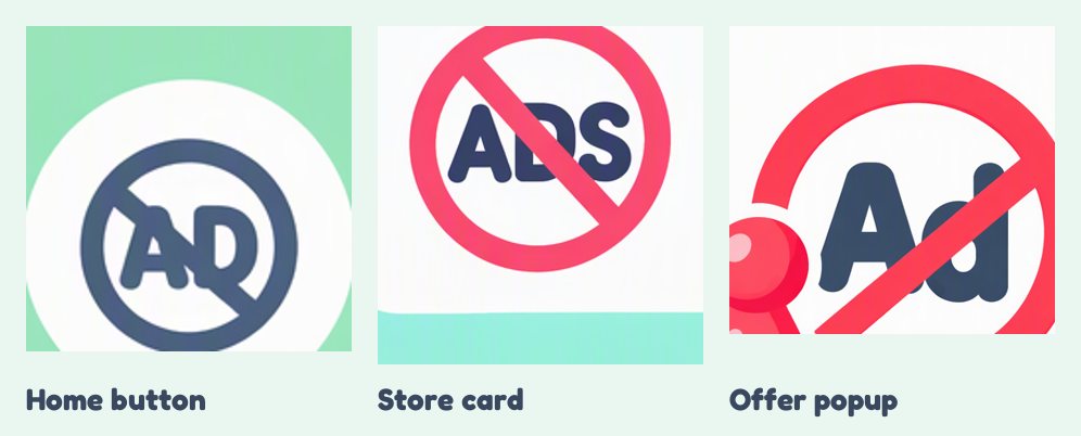
Three screens, three "no ads" icons. So I had the agent compare every component across all 12 screens. It found 14 inconsistencies: a coin counter that became a trophy on one screen, three styles of close button, two styles of tabs, a daily-reward Day 6 that was an empty pedestal. Then I found a 15th it missed: the popup cards weren't the same card.
This is what "a human eye is needed" means. Every screen passed on its own. The set didn't.
The fix was a shared UI kit: one close button, one no-ads icon, one coin, one tab control, generated once from the design sheet. Even the kit came back with "MAP" and "LIST" written on blank tabs.
Getting the fixes in: four ways, four results
The most useful thing I learned in the whole run:
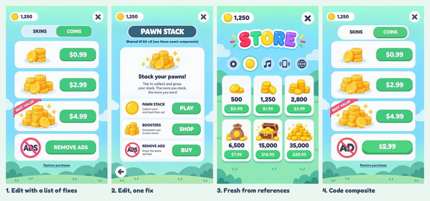
- Edit the screen with a list of fixes. 12 of 23 landed. The first fix or two go in, and the rest get quietly dropped.
- One fix per call. Worse. It redrew whole screens, and copied the kit sheet's caption, "Shared UI kit v2 (use these exact components)", into the UI as text. Anything written on a reference image can end up in the output.
- Generate fresh, with the kit as a reference. Great for some screens. On the store, it used the kit's icons as a row of buttons. Without an anchor, it treats the kit as a shopping list, not a style guide.
- Code. The agent pasted the real kit components onto the screens. Exact, every time. Same for the popups: five generated cards replaced by the one real
panel-card.
Generation is for exploring. Once you're fixing small details, stop prompting and start composing. The pieces are already cut. Put them where they belong.
Step 5: The HTML Mock
Before any engine, a page in the browser, built only from the cut sprites. Every label is live text. You can drop pawns, topple the tower, buy a skin and flip the settings.
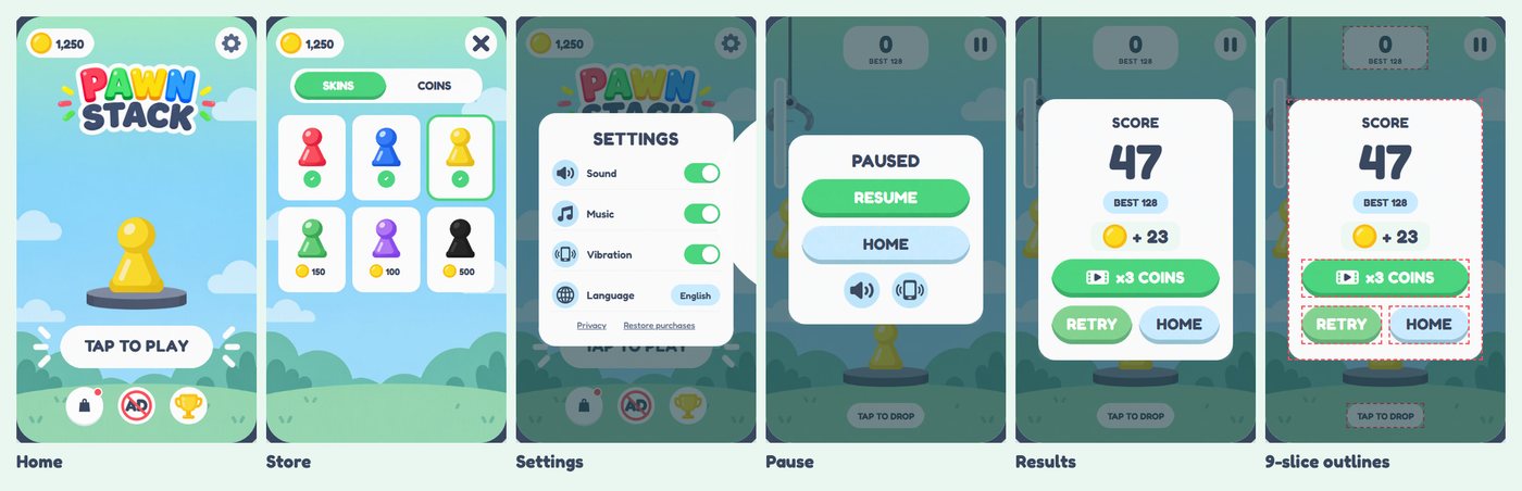
You click through the real flow and feel what's missing. And if the kit works in a browser, they'll work in Unity.
Back to the Question
- Figma + MCP? Not needed.
- Easy to change the spec? The design sheet and the UI kit are the spec. Change them, and the next screens follow. Change a kit component, and code puts it on every screen.
- Board-game pieces? The easy part. Five pawns, a pedestal and a claw came out clean in one round. The work is in the UI around them.
- Import? Cut PNGs and one rule: text is never in the art. The Unity side is in the Codex plugin post.
- The member's tip is right. The ten gameplay moments were that test, and they found the continuity problem before a single sprite was cut.
What It Cost
From the Azure bill, not estimated:
- GPT-Image 2.5 sunburst: 88 images, $3.95
- GPT-Image 2.5 flare: 10 images, $0.59
- GPT-Image-2: 4 images, $0.16
- Total: 102 images, about $4.50
Pricing is per token, so edits with several reference images cost more than plain prompts. The agent's work (cropping, measuring, auditing, compositing) ran on my Claude Code subscription and isn't in this number.
The image work took 1 hour and 34 minutes. So the real cost of this pipeline isn't the images. It's the checking.
Keep Your Humans
The model didn't flag a single problem in this post. Every one was found because a person looked, or told the agent what to measure: the pawns 24% apart in height, the three "no ads" icons, the four greens, the popup cards the audit missed. And that person was me, a tech guy with a decent eye.
Now think what an art director would have caught. Spacing, weight, contrast, the feel of the whole set. Things I don't even know to look for.
The AI makes the assets fast and cheap. For the art to be good, you still need humans looking at it.
Get the next experiment in your feed
I run tests like this one on AI and game dev, and share the real numbers and the mistakes. Subscribe to the newsletter on LinkedIn.
Subscribe on LinkedIn →
Rather talk it through with other devs first? Join our GameDev AI community.